An excellent time to link to McMansion Hell's various guides on McMansions. Two good starting points are "What Makes a McMansion Bad Architecture" [0] and "The 10 Circles of McMansion Hell" [1].
I guess I'm not getting it. They say "The secondary masses should never compete with the primary mass" but never says why. Why is having six masses combined by a primary mass to fill in the gaps a bad thing? At least with "too many voids" they say "looks like swiss cheese". Same thing with symmetry, why is a poorly balanced house bad? Why does a house have to follow the "rule of thirds"? That's never explained in the article.
Something makes me think that the author has never seen a Tuscan villa, because that "six secondary masses" house is clearly a villa-inspired home. And villas are often non-symmetrical, out of proportion, full of secondary masses, and certainly do not follow the rule of thirds. Part of their entire appeal is that they appear to be several small buildings connected together after they were built.
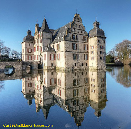
I don't have anything either for or against McMansions, but after reading that first link I'm not convinced that the author knows what makes McMansions "bad" either. In the second link some of the houses in "the 10s" look exactly like German manors. Compare the second "10" picture with this one: http://www.castlesandmanorhouses.com/photos/bodelschwingh..j...
Is that 13th century German manor a "McMansion" too?
> Is that 13th century German manor a "McMansion" too?
Look, you'd really have to read the blog before making comments on it. Always a good idea. First read - in this case, all of it! - and then talk about it. Please. The blog explains very well how to recognise a McMansion and it really isn't that hard.
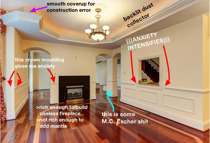
As for why McMansions are bad, there are plenty of explanations given in this blog (areas hard to reach, cheap materials, wasted space, water damage after a short time, etc...). Just look at this one image, plenty of reasons: http://99percentinvisible.org/app/uploads/2016/10/18-mc-esch... (dust collection areas, unsafe fireplace, etc.)
It doesn't have to. These are just general rules that usually make things look good. You can make good-looking things that don't follow the rules if it's done thoughtfully and with a design purpose in mind.
McMansion builders are not doing thoughtful design with some sort of aesthetic vision, though. They're slapping together the cheapest materials they can find, as quickly as possible to make the highest profit. That's why it ends up looking bad. They didn't use 5 different kind of windows because they had some design vision that requires it. They used 5 different kinds of windows because the contractor said "Hey, I've got a bunch of different windows left over from other jobs, let's use them here so we don't have to buy new ones."
Thank you, that's what I kept expecting the article to say. I was waiting for them to say "this looks bad because they cheaped out", "this looks bad because it was designed around spare parts", "this feature is a sign that they were cutting costs", etc. But they didn't. They just said "this is bad, moving on, this one's bad too, next one..."
As it stands, it's a McMansion of an article. A lot of things thrown together without any rhyme or reason, sold to people who don't know any better, and marketed as the epitome of high culture. It did nothing to further my understanding of what is a good house and what is a bad house except "if you cut it in half, you have two identical halves... most of the time... but not always".
I understand why McMansions suck, and I can use the same reasons to say the same thing about the McMansion Hell articles. They're full of "this is bad" without any "this is why" attached. And a lot of the "this is bad" stuff appears on houses that are definitively not McMansions (like villas and 13th century manors).
I think the original point of this blog was just to make fun - as it says on most articles, it's satire. Meant to entertain and make fun in the first place.
There's an old game called "the sims" where perhaps tongue in cheek the criteria for how much your Sim loved the house it lived in was the McMansion criteria of the linked articles, nothing matches nothing balances no 90 degree corners no flat surfaces proportions are very weird.
Ironically the house being awful results as a side effect in being very expensive to build, so from a conspicuous consumption standpoint its simultaneously hard to avoid noticing none of the windows match at the same time as its noticed clearly no one got a Federal style bulk discount on those windows, or the floor plan and roof line being, well, insane, was likely very expensive to build. You might have to live in an ugly house, but everyone will know you have money. Oh the fed dropped interest rates again so we have an extra $100K to spend, well, if you already have five dormers why not seven and toss in some columns on the side door entrance?
Wow, I never made this connection but the McMansion you described sounds remarkably like my humongous fancy houses I used to pride myself on in Sims! Do you have any sources discussing this? I have some friends who would appreciate it :)
Well, like a decade ago people would illegally download software with titles like "The Sims 3: Katy Perry Sweet Treats" (unfortunately not making this up) and buy or otherwise obtain the 3rd party guidebook. I just read how to max out your house score in SIMS right out of the guidebook and it had those hints like listed as bullet points, which even back then made me LOL that SIMS3 gamified mcmansion design.
And I remember it a decade+ later because it pissed me off quite a bit that hardcoded into the game software was the value judgement that a mcmansion was superior to my designs for log cabins and castles. What do you mean my sims characters will suicide if I don't put a bay window in my log cabin, this game which had promise is such BS. Well maybe I didn't expect much from the "Katy Perry Sweet Treats" add on but I expected better of the original.
There are aesthetic value judgements built into sim games like Dwarf Fortress but they're weird enough that they don't feel as constraining.
People were wasting time building useless things in computers a long time before minecraft, after all.
- some of the windows actually match (and are even symmetrically aligned)
- the garage takes up less that half of the house's front face
- the columns next to the door are neither too tall nor too skinny
McMansion on the lower left: http://99percentinvisible.org/app/uploads/2016/08/american-v...